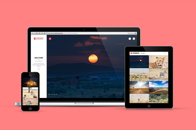
Any professional web designer will tell you that their number one priority is simplicity. The cleaner, and more simple your website, the better your sales and conversions. It’s that simple. As web users, we’re looking for simple, speedy information. Unfortunately, not a lot of website owners got the memo! Many are still running fussy, complicated websites. They’re not appealing to the eye, and they’re tricky to navigate. Remember, you’re looking for the best possible user experience. Here are five low-hanging fruits you can easily implement to simplify your web design.
- Highlight the essential elements. Lose the rest!
Your website is designed for a purpose, right? Your goal is to sell products or attract signups. Highlight that goal, and make sure everything leads straight to it. The crucial elements of your site are as follows. First, the logo and branding. Make sure they are prominent, and powerful. Second, your value proposition. That’s the part that tells people exactly what you do, and why they should trust you. Thirdly, your call to action. That’s what people should do next. It could be signing up to the mailing list or downloading a trial version. It’s hard to make the cut, but lose anything that doesn’t serve a purpose!
- Speed up your checkout process
One of the most complicated aspects of any website is the checkout process. Websites always ask us 100 questions before we make it to the end. This process is so convoluted that more than half of people abandon their cart along the way. That’s a huge loss of profit! You need to direct people through this process quickly. Ask for as little information as possible, and help them along the way. You can do this with a postcode address finder API. That will find your customer’s full address from the postcode. It’s little things like this that make your site simple.
- Put more above the fold
‘Above the fold’ refers to everything you can see before you scroll down. A large portion of your visitors won’t even bother to scroll below the fold. With that in mind, put all the useful information at the top of the page. Make sure all the useful information is right there in front of your visitor’s eyes!
- Simplify the colour scheme
Every designer has an internal battle going on inside. Part of them wants to create something artistic and colourful. The other half wants to make sure the design is simple and user friendly! It’s all about finding a balance between creative and practical. A simple colour scheme is the best way to stay on the right side of that balance. Choose a simple colour palette, and try to stay within it.
- Reduce the number of pages
The last thing you want is your visitors clicking through lots of pages to get where they want to go. Try to keep all your information on just a few web pages. Remove any pages that take the visitor away from your ultimate goal.
That’s all for today, folks! Check back soon for more web design advice.

